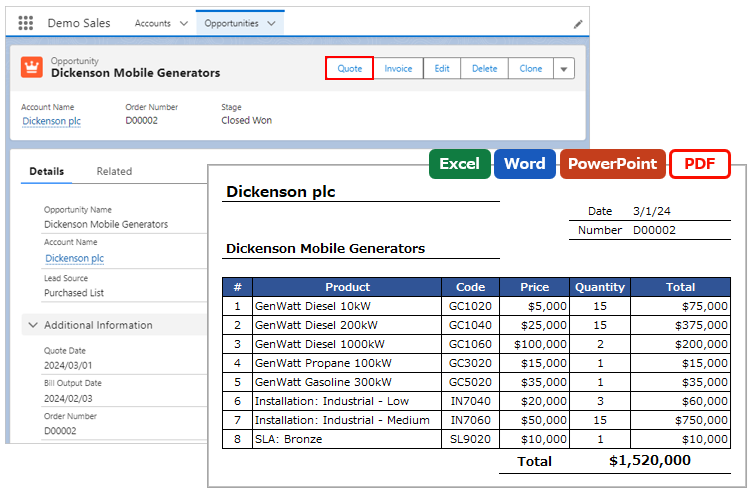
Displays an HTML preview on the record detail page or in a new browser tab.
*This feature is available in Office File Creator Pro.
ofcHtml Component
Place the ofcHtml component on the record detail page to display a preview within the page.
Settings
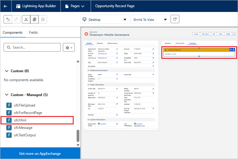
Open the record detail page of the target object and click Setup > Edit Page. Alternatively, click Setup > Object Manager > target object > Lightning Record Pages.
Select "ofcHtml" under "Custom - Managed" in the left sidebar and drag and drop it to the position where you want it displayed.
Select the component you placed, enter the values, and then click the "Save" button.
*If the Lightning page has not been activated, such as when you change a Lightning page for the first time, activate it with the "Activation" button.
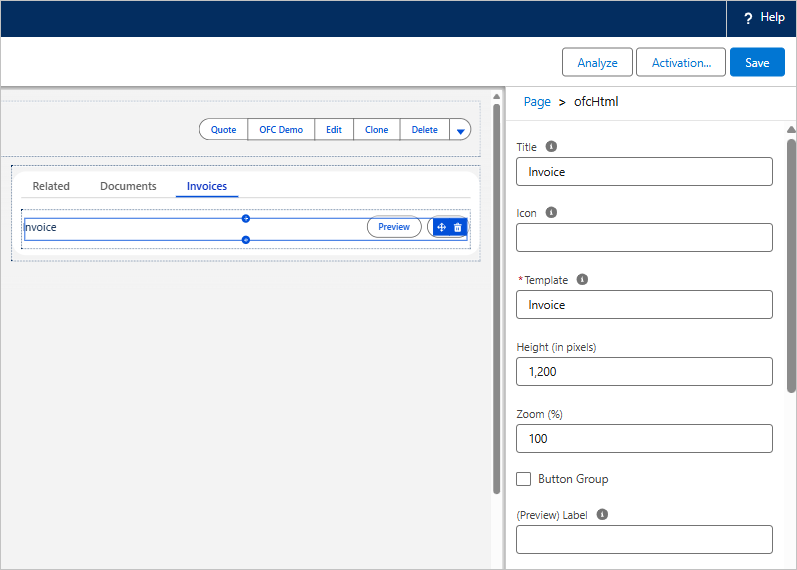
Property List
| Property | Contents |
| Title | Component title.
e.g. Invoice |
| Icon | Icon of the component. Enter in the format "Icon Type:Icon Name", all lowercase.
e.g. standard:quotes |
| Template | Template API name for the OFC_Template record. Set a template for HTML. |
| Height (in pixels) | Height of the preview display area. Enter the value in pixels.
Default: 1200 |
| Zoom (%) | Zoom level of the preview (%). Enter a value between 30 and 200.
Default: 100 |
| Button Group | Spacing between buttons when multiple buttons are placed.
|
| (Preview) Label | Label name of the preview button. If left blank, "Preview" is displayed.
e.g. Invoice Preview |
| (Preview) Style | Sets the style of the preview button from the picklist. If left blank, neutral is applied.
|
| (Preview) Icon | Icon of the preview button. Enter in the format "Icon Type:Icon Name", all lowercase.
e.g. utility:preview |
| (Print) Label | Label name of the print button. If left blank, "Print" is displayed.
e.g. Invoice Print |
| (Print) Style | Sets the style of the print button from the picklist. If left blank, neutral is applied.
|
| (Print) Icon | Icon of the print button. Enter in the format "Icon Type:Icon Name", all lowercase.
e.g. utility:print |
Preview and Print
Clicking the "Preview" button displays the preview.
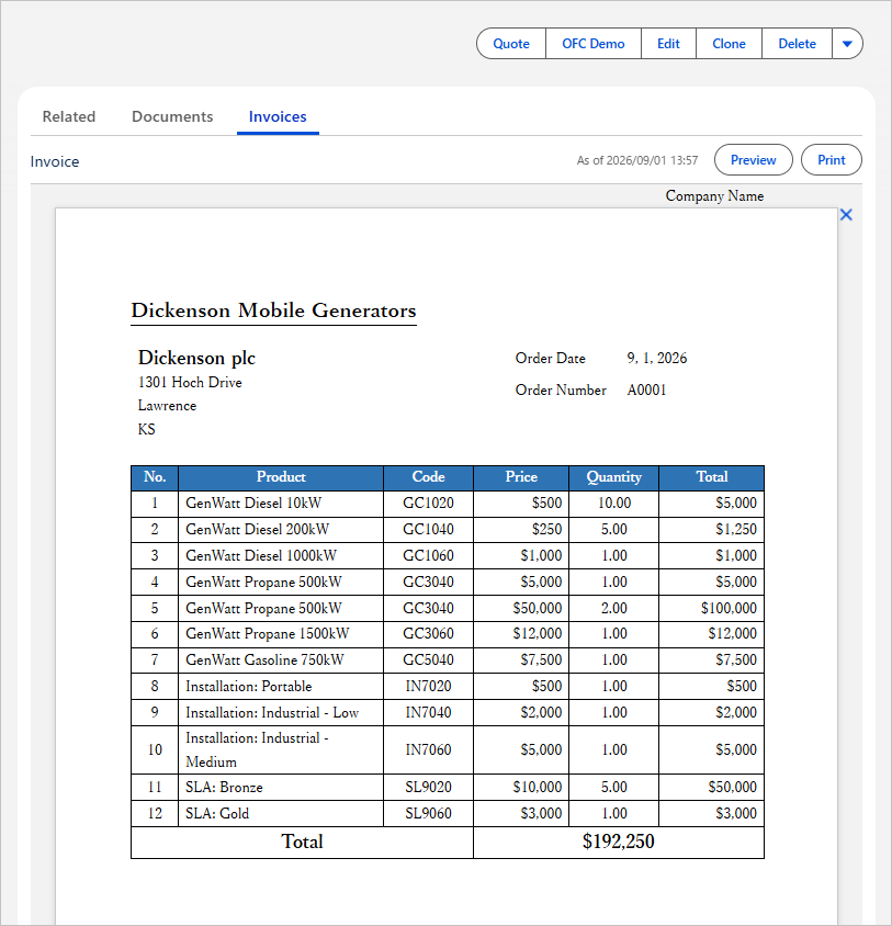
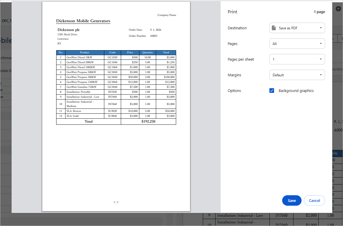
Clicking the "Print" button opens your browser's print dialog, which displays the contents of the preview screen. Select "Save as PDF" to download the file as a PDF.
*If nothing is shown in the preview screen, the preview is displayed and the print dialog opens.
Considerations
When a file is saved as PDF from the "Print" button of the ofcHtml component, the default file name is set to "Name field value_Object name_Salesforce" (e.g. Mobile Generators_Opportunity_Salesforce). To apply the "Output File Name" of the OFC_Template record, use a custom button or a Lightning component button.
Custom Button
A custom button displays the preview and the print dialog in a new browser tab.
When creating the custom button, use the link in "Custom Button URL (Preview)" or "Custom Button URL (Print)" of the OFC_Template record as the URL of the custom button. For instructions on creating a custom button, refer to Create Custom Button.
Custom Button URL (Preview): Displays the preview in a new browser tab.
Custom Button URL (Print): Displays the preview in a new browser tab, and then displays the print dialog.
Lightning Component Button
A Lightning component button displays the preview and the print dialog in a new browser tab.
When creating the Lightning component button, set the "(Button XX) Save" property of the ofcForRecordPage component to "preview" or "print". For instructions on creating a Lightning component button, refer to Create Lightning Component Button.
preview: Displays the preview in a new browser tab.
print: Displays the preview in a new browser tab, and then displays the print dialog.
Reference