Create buttons on the Lightning record page.
Create Lightning component buttons
Open the record detail page of the target object and click the "Edit" button to open the Lightning record page.
Or, open the Lightning record page from Settings > Object Manager > Target Object > Lightning record page.
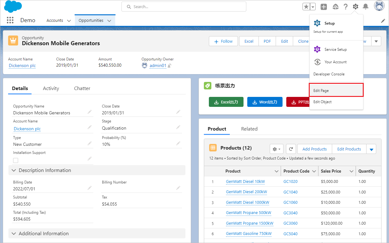
Drag and drop "ofcForRecordPage" in "Custom - Manage" on the left sidebar to the position where you want the button to appear.
For Office File Creator Ver.1, select "officefileCreatorCmp".
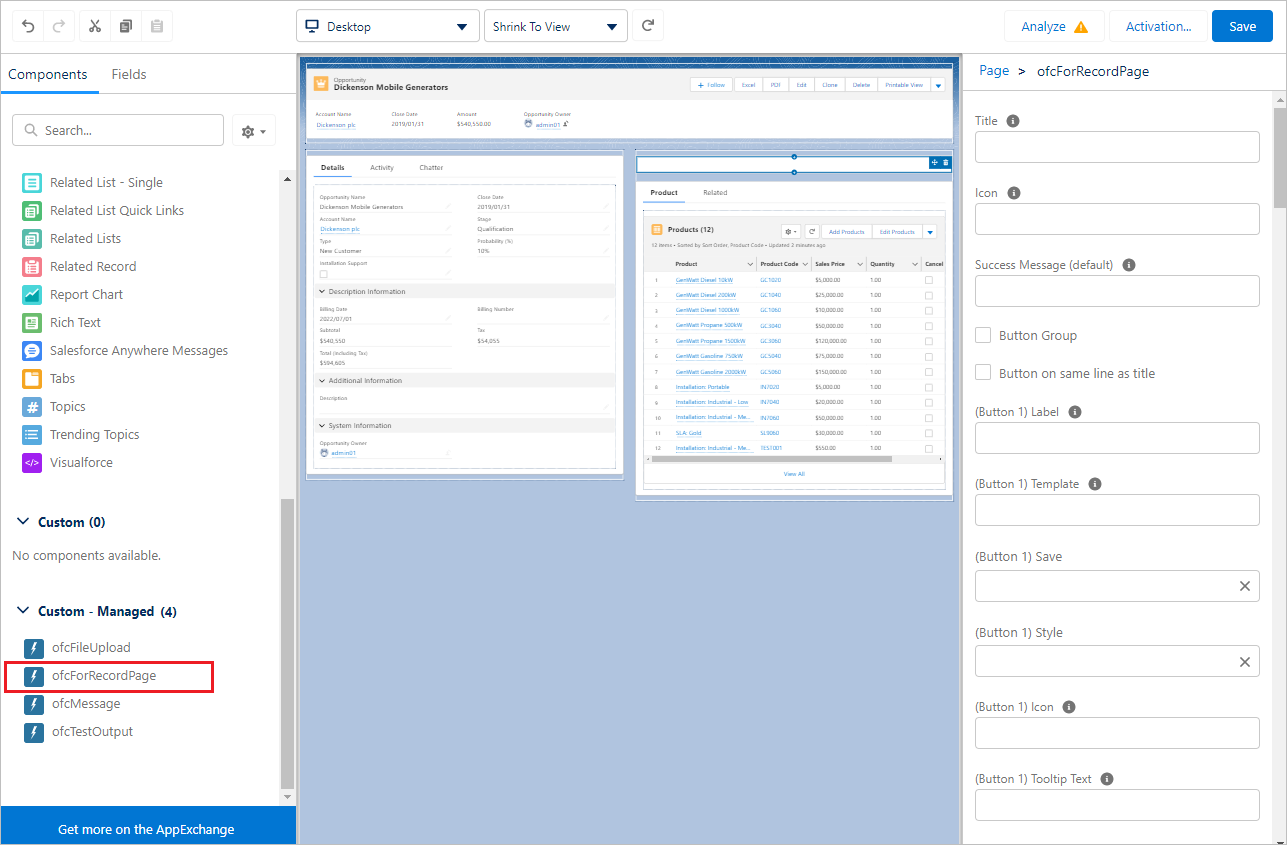
Select the placed component, enter various values, and click "Save". 10 buttons can be placed in one Lightning component.
If you are modifying a Lightning page for the first time and have not activated the Lightning page, click the "Activate" button to activate it.
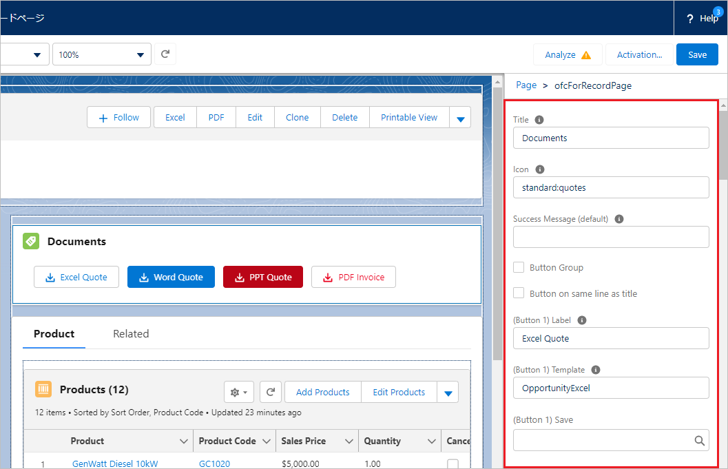
Settings
| Field | Contents |
| Title | Component Title
e.g. Documents |
| Icon | Icon of the component. Enter in the format "Icon Type:Icon Name", all lowercase.
e.g. standard:quotes |
| Success Message (default) | Default message to be displayed after file output and saving is complete. If left blank, no message will be displayed. |
| Button Group | Spacing between buttons when multiple buttons are placed.
|
| Button on same line as title | Display position of the button when Title or Icon of the component is displayed.
|
| (Button 1) Label | Button label name
e.g. Excel |
| (Button 1) Template | Template Api name for OFC_Template record, must be entered if Label is set. |
| (Button 1) Save | Sets how the file is saved.
|
| (Button 1) Download | If "file" or "attachment" is set to the "(Button 1) Save", set "true" to download the file in addition to saving the file.
*Option for Ver.2. |
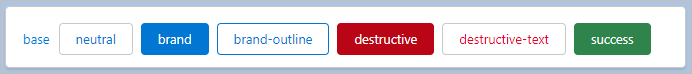
| (Button 1) Style | Sets the style of the button from the selection list value. If left blank, neutral is applied.
|
| (Button 1) Icon | Icon of the button. Enter in the format "Icon Type:Icon Name", all lowercase.
e.g. utility:download |
| (Button 1) Tooltip Text | Tooltip text that appears when the mouse cursor hovers over a button. |
| (Button 1) Success Message | Message to be displayed after file output/saving is complete.
If this field is left blank, "Success Message (default)" will be displayed. |
To display multiple buttons, set (Button 2) through (Button 10) in the same manner as (Button 1). If you enter (Button XX) Label, be sure to enter (Button XX) Template.
About Icon
Refer to the Lightning Design System for the Icon name to be set. Select Icon Type from Utility, Doctype, Standard, Custom, or Action and enter it in the format "Icon Type:Icon Name". Set all in lowercase.
e.g. standard:quotes
e.g. utility:download

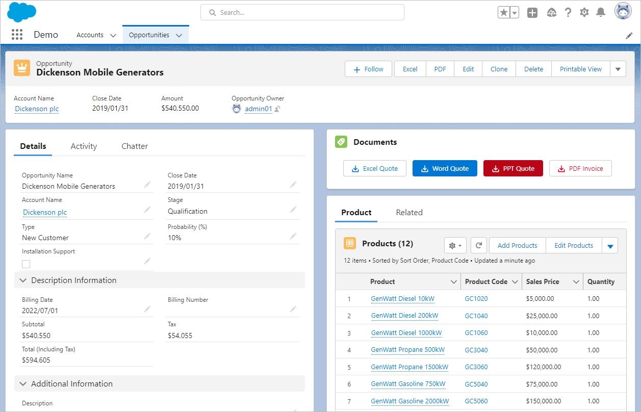
Sample screen after placing buttons
Reference
Icon samples for the document buttons & titles